Local Variables and Properties
The Role of Controls and Variables
For those familiar with text-based programming languages, the concept of variables as containers for storing data is fundamental. However, when working with LabVIEW, it's crucial to adjust this understanding. In LabVIEW, the direct equivalent of a variable in text-based languages does not exist. Instead, other elements within LabVIEW serve the purpose of holding and transferring data, akin to the role of variables in text-based languages.
One experienced in text programming might initially perceive LabVIEW controls as variables. This comes from the reasoning that since both variables and controls store data, controls should serve as variables in LabVIEW. This approach, while understandable, doesn't fully embrace LabVIEW's unique dataflow paradigm. Treating controls as traditional variables can lead to inefficient and error-prone code.
The primary role of controls in LabVIEW is to facilitate data input and output. They serve as interactive user interface elements and as means for data exchange in sub-VIs, akin to input/output parameters or return values in functions or methods in text-based languages. In sub-VIs, controls are similar to the parameters passed to and from functions.
So, what is the LabVIEW equivalent of variables? The answer lies in data wires. Data in LabVIEW flows sequentially from one node to another along these wires. In this sense, a data wire in LabVIEW can be thought of as a temporary data carriers, existing only as long as needed to transfer data between nodes. This concept underscores the fundamental difference in how LabVIEW handles data, emphasizing the flow and transformation of data over time, rather than the static storage commonly associated with variables in traditional programming languages.
Labels and Captions
In LabVIEW, controls feature two distinct properties that are often confused: Label and Caption.
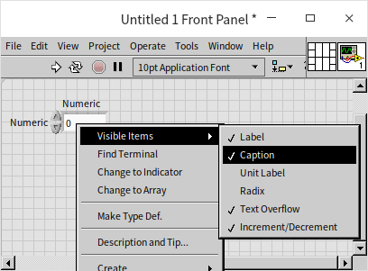
Both properties are designed to provide descriptive names to controls, but they serve different purposes. Labels act as unique identifiers for each control and remain static during program execution. In contrast, Captions are dynamic, primarily intended for display purposes on the user interface and can be modified at runtime.
It's important to ensure that Labels are unique within a VI and to avoid leaving them blank. Captions, on the other hand, are particularly useful for software localization and can be set to hidden, displaying only the control without any text.
When a new control is dragged onto a VI's front panel from the control palette, it initially comes with a Label but no Caption. To add a Caption, simply select "Caption" under "Visible Items" in the control's right-click menu, and LabVIEW will automatically generate one for you.
For effective use of Labels and Captions in your VIs, consider the following recommendations:
| VI Type | Label Usage | Caption Usage |
|---|---|---|
| Low-Level VI | Visible (used as an identifier). | Default state (usually empty). |
| User Interface VI | Hidden, with English labels for multilingual versions. | Visible and localized for multilingual versions. |
| API VI | Hidden, with English labels for multilingual versions. Avoid indicating default values. | Visible and localized for multilingual versions. Include default values and data units in parentheses where applicable. |
Remember, if you need to alter the textual information of a control dynamically during runtime, only the Caption property is suitable for this purpose. Additionally, if a control appears to have different names on the front panel and the block diagram, it indicates that the front panel is displaying the Caption and not the Label. This distinction is crucial for understanding how controls are represented and interacted with in both the front panel and block diagram environments.
Default Values
In programming languages like C++, running a standalone function independent of the main program is not feasible, often complicating the debugging process. For instance, to test a specific sub-function, you must first establish a complete project, implement the main() function, define necessary variables, pass parameters to the sub-function, and then execute it. This process can be quite cumbersome and time-consuming.
LabVIEW, however, offers a notable advantage in this context. Each VI in LabVIEW can be executed independently, facilitating easier testing and debugging. Of course, to ensure accurate execution, appropriate input parameters are required.
Before execution, if you assign sensible default values to the controls on the VI's front panel, these values are used when the VI is run. Every control in LabVIEW is equipped with a default value. For instance, a numeric control newly placed on a VI's front panel defaults to 0. This value will reset to its default every time you close and reopen the VI, even if it was changed during the previous session. If you frequently use a value different from the default, say 0.5, for a numeric control, it's practical to set this as the new default. To do this, adjust the control's value to 0.5 and then choose "Data Operations -> Make Current Value Default" from the control's right-click menu. The next time you open the VI, the control's value will be 0.5 by default.
When a VI functions as a sub-VI, its front panel controls act as input parameters. In such cases, it's not always necessary for the calling (higher-level) VI to provide a value for every parameter of the sub-VI. If a value is not provided, the sub-VI will automatically use the control's default value as the input parameter. This feature simplifies the sub-VI's integration, as the most commonly used values can be preset as defaults. It's also a good practice to indicate these default values in the control's label or caption for clarity and ease of use.
Consider the following example: in a program that utilizes the "Open Config Data.vi" sub-VI, you can observe from the context help that the "Create File if Necessary" parameter of the sub-VI has a default value of "True". If this behavior is desired, there's no need to explicitly pass a "True" value to this parameter. The input terminal can remain unconnected, and the sub-VI will automatically employ its default "True" value during execution.

Local Variables
Creating Local Variables
Local variables can be created for any control. This is done by right-clicking on the control or its terminal on the block diagram and selecting "Create -> Local Variable".
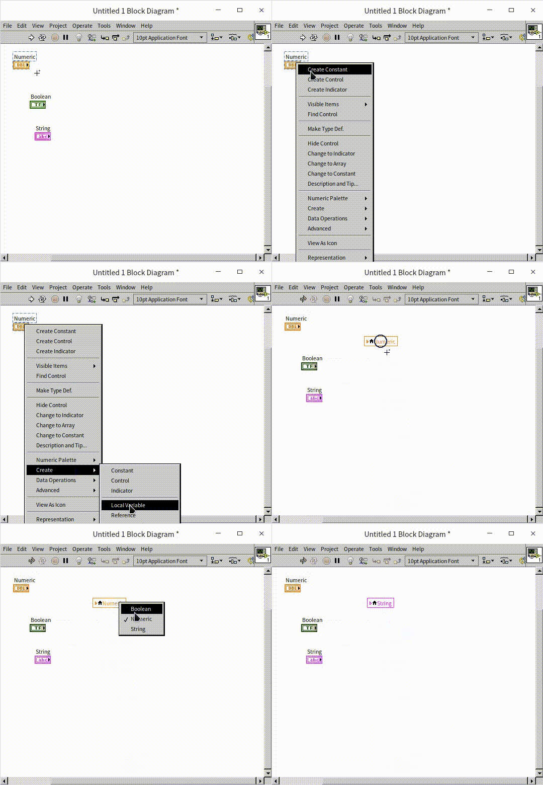
Once created, a local variable is represented as a rectangular icon with a small house symbol on the block diagram (in older LabVIEW versions, it's indicated by a rectangle with a double-line border). This rectangle also displays the label of the associated control. The local variable mirrors the data in its corresponding control, meaning any changes made to the control's data are automatically reflected in the local variable, and vice versa. You can link a local variable to other controls within the same VI by simply clicking on it.
Local variables offer flexibility in data manipulation. Whether a control is for input or output, its local variables can function in both directions. You can toggle a local variable between reading and writing modes using options like "Change to Read" or "Change to Write" found in its right-click menu.
Local variables offer a streamlined way to access and manipulate data within a VI without relying on direct wire connections. They overcome the limitations of terminal directions and can be adapted to either read or write data as needed. However, it's important to note that local variables are sometimes overused or misused, particularly by those transitioning from text-based programming environments. In LabVIEW, local variables are not intended as primary means for data storage or transfer during a VI's execution. Their primary role is to support control manipulation within a VI. Data flow and communication within a VI should primarily occur through data wires, with local variables employed sparingly and strategically. Misuse of local variables can lead to confusing, inefficient, and error-prone code. Therefore, it's crucial to understand their proper place and function in the LabVIEW programming paradigm.
Interacting with Controls
In certain scenarios, a VI may need to perform operations like writing data to input controls or reading data from output indicators. For instance, consider a VI designed to handle text input: if the text entered into a string control is four letters or fewer, it displays as entered; if it exceeds four letters, the string control is automatically cleared. Since the terminal of an input control typically serves as a data source and cannot directly accept data, a local variable is employed to update the control's content. This principle also applies when you need to read values from output indicators.
The following program illustrates this functionality:
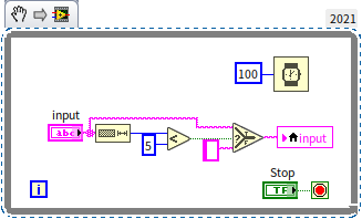
In this example, it's essential to set the "input" control to "Update Value While Typing" via its right-click menu. This setting ensures that the program responds dynamically as the user types in the control, enabling the immediate evaluation and updating of the input based on the specified condition.
Data Sharing Across Multiple Threads
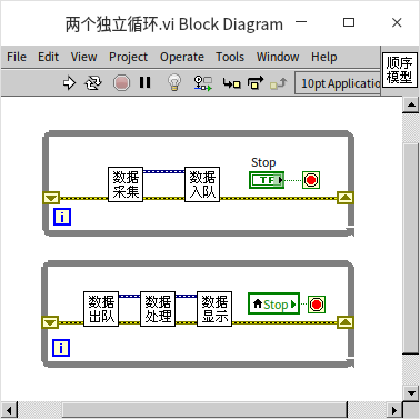
The block diagram above features two independent loops. These loops are not connected by data wires, leading LabVIEW to treat them as separate entities and execute them concurrently. The objective is for these loops to operate in parallel, each carrying out distinct tasks, and to halt simultaneously when the "Stop" button is clicked by the user.
In LabVIEW, segments of code that don't have a sequential dependency are executed in different threads, allowing for simultaneous operation. A thread in LabVIEW is essentially a segment of code that runs
independently, and when multiple such segments run concurrently without interdependencies, they form multiple threads. This approach to multi-thread programming enables efficient parallel processing of different tasks within the same VI. Detailed exploration of multi-thread programming in LabVIEW, including best practices and optimization techniques, will be covered in the Multi-Thread Programming section.
In the given program, the terminal of the "Stop" control is linked to the termination condition of one loop, while its corresponding local variable governs the stop condition for the other loop. Activating the "Stop" button updates the local variable in real-time, leading both loops to concurrently receive the "true" signal at their respective stop condition inputs, resulting in a simultaneous halt.
The use of local variables is crucial when identical data must be accessed and acted upon simultaneously across multiple threads. However, the program's block diagram presented below offers a different approach, utilizing direct data wires instead of local variables. Here, the signal read from the "Stop" button is wired directly to the stop condition inputs of both loops. The question arises: will this setup effectively and simultaneously halt both loops?
In understanding how LabVIEW loops function, it's important to recognize that they exhibit specific behaviors regarding data flow: if a loop receives data from an external source, the program typically waits for this incoming data before commencing the loop's iterations. Conversely, if a loop outputs data, the program generally waits until the loop completes to deliver this final output value.
In the above scenario, a data wire extends from within the upper loop to the exterior and then feeds into the lower loop. This configuration implies that the lower loop is dependent on the output of the upper loop, establishing a sequential dependency between them. Consequently, when the program runs, the upper loop initiates first. Only after the "Stop" button is clicked, causing the upper loop to terminate, does the "Stop" signal get transmitted out of the loop. Subsequently, this "Stop" data enters the lower loop, which then starts and instantly ceases after a single iteration due to receiving the "true" stop condition. This operational logic deviates from the intended design of running both loops in parallel.
Property Nodes and Invoke Nodes
Property Nodes
Property nodes are essential tools for accessing and manipulating the properties of controls that go beyond the scope of what's available in the control's property dialog. This feature is particularly useful for dynamically reading from and writing to control properties during runtime.
To create a property node, right-click on a control or its terminal and select "Create -> Property Node". This action provides access to a wide array of specific properties for the chosen control. For example, the properties of a standard numeric control are shown below:

For beginners, remembering all the properties might not come easily, but LabVIEW offers a handy solution with its Context Help feature. When you select a property node, you can open LabVIEW's Context Help window. Hovering your mouse over different properties will prompt the Context Help window to display an explanation for that property. The properties in the selection menu are organized by their respective categories. For instance, excluding the "Browse" option, the first row in the above example includes properties common to all LabVIEW objects, like the VI containing the object; the next row lists properties specific to all front panel objects of VIs, such as their position and size; followed by properties that all controls share, like title and visibility; then come properties unique to numeric controls, including various attributes of unit labels; and at the bottom are properties specific to the selected numeric control, such as settings for display format. Within each category, properties are sorted alphabetically.
Different types of controls will have additional specific properties visible in the list. For example, button controls might have a "Button Text" property, while string controls could have a "Single Line Display" property.
As noted, the property selection menu is organized by categories. So, how many control categories does LabVIEW have? A helpful method to explore the hierarchical type relationship of LabVIEW objects involves creating a "Programming -> Application Control -> Class Specifier Constant" on the block diagram. Clicking on this constant reveals the hierarchy in a menu, showing LabVIEW objects from the most general to the most specific:
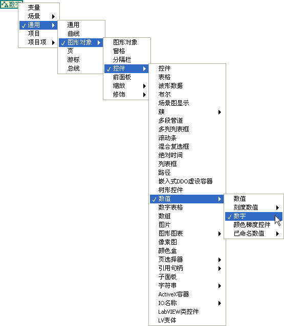
The section on “The Hierarchy of Object Classes” in this book will delve into control categories in more detail.
Properties can be read-only, write-only, or both readable and writable. The right-click menu for a property allows you to select "Change All to Write" / "Change All to Read" or "Change to Write" / "Change to Read" to adjust the property's direction. Some properties, even though writable, can only be modified when the VI is in edit mode, such as the text label of a control. Therefore, it's crucial to verify whether the property node returns an error when setting control properties. The help documentation provides comprehensive details for property items.
A property node can simultaneously read and write multiple properties. By hovering your mouse over the middle part of the property node's lower edge, you can expand or contract it. Clicking on the added entry allows you to swap it for the property you require. The menu also features "Add Element" / "Delete Element" options for performing these actions.
In property items, there's an option labeled "Value," akin to the local variables discussed in the previous section. However, during program execution, property nodes are significantly less efficient than local variables. Another property, "Value (Signaling)," is designed to emit a "Value Change" event signal for the control. This will be elaborated on in the Event Structures section.
Property nodes default to displaying each property's short name, essentially the English abbreviation. Through the property node's right-click menu, you can switch to the long name display, which allows for the use of names in Chinese:
Associating Controls with Property Nodes
If there's already a property node for a control on the block diagram and you need another identical one, your first instinct might be to copy and paste. Selecting the property node and pressing Ctrl C followed by Ctrl V, you'll find that the copied property node doesn't quite look the same as the original (as seen below). This discrepancy occurs because the copied property node has not been associated with any control yet. The use of such unassociated property nodes will be covered in greater detail in the section on Dynamic Interface Adjustments. By choosing "Disconnect From Control" from a property node's right-click menu, it becomes an unassociated property node. Similarly, you can reassociate it with a control using its right-click menu:
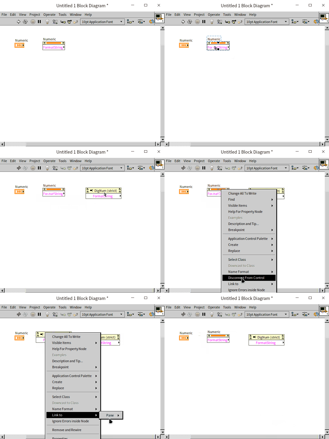
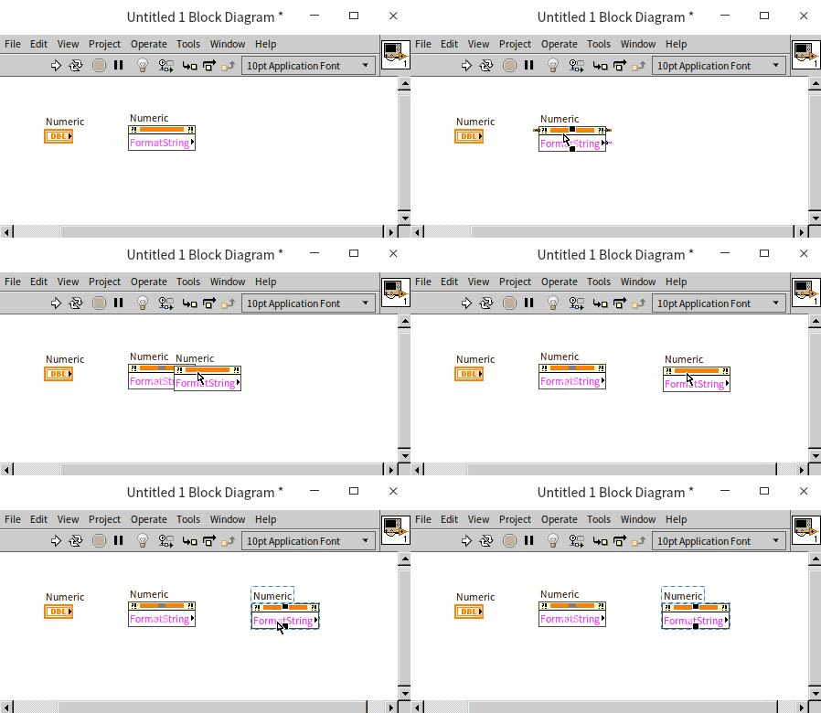
Property nodes can indeed be copied, but not via the Ctrl C shortcut. Instead, by holding the Ctrl key and dragging a property node with the mouse, you can create a duplicate. This copying technique isn't limited to property nodes; it applies to nearly all objects in LabVIEW, including controls and functions. The following image demonstrates copying while holding the Ctrl key:
Invoke Nodes
Invoke nodes in LabVIEW are somewhat akin to property nodes but serve a distinct purpose. They are utilized to execute specific methods that perform actions on controls. Each invoke node is limited to selecting and executing one method at a time.
For example, an invoke node can be used to create an "Object Highlight" function for a control. This feature is particularly useful for visually emphasizing a control within the program:
LabVIEW offers a vast array of property and invoke nodes, each catering to various functionalities and applications. This book introduces some of the more common uses to familiarize readers with their basic operations and potential use cases. However, there is a wide spectrum of possibilities with these nodes, and users are encouraged to explore and experiment to fully leverage their capabilities in diverse programming scenarios.
Adjusting Control Positions and Sizes
During program execution, there are occasions when it becomes necessary to modify the position or size of controls dynamically. This functionality can be achieved by setting the position and size properties of the controls. For instance, consider the following program where the position property of the "stop" button is configured in a specific pattern to enable circular motion on the front panel:
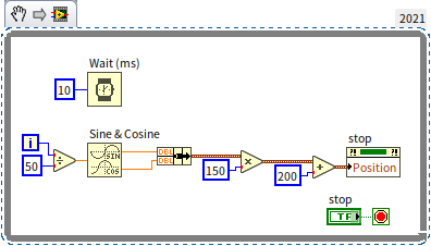
Here's how the program operates:
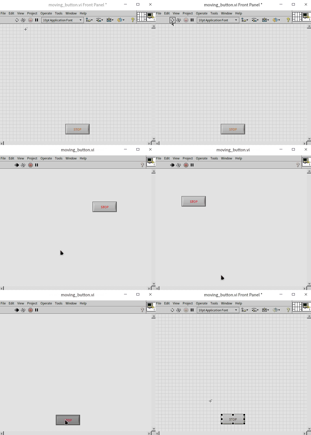
Readers are encouraged to experiment with the program and try clicking the stop button. If this task seems too simple, rest assured, later chapters of this book will introduce more challenging interactive buttons.
In more complex interfaces, displaying different controls under varying conditions is often required. One way to manage this is by utilizing the "hide" property, effectively concealing controls when they are not in use. However, this approach can complicate the editing and debugging process since the hidden controls and their properties become inaccessible on the front panel. A more practical method involves adjusting the position of controls, relocating them outside the visible area of the window when they are not needed. By expanding the front panel window during the editing phase, all controls can be viewed and adjusted.
The properties related to position and size are fundamental, not only for interactive controls but also for purely decorative elements on the front panel, such as those found in the "decoration" control panel. Subsequent chapters in this book will delve into techniques for managing a wider array of objects within a program, demonstrating the versatility of these properties in creating dynamic and responsive user interfaces.
Modifying the Control Captions
Program Objective: The task is to add a numeric control on the user interface for entering either a length or a weight value. Accompanying this, an enumeration type radio button control is placed, allowing users to select what the numeric control represents – either length or weight.
To achieve this, the program must dynamically alter the Caption property of the numeric control. The caption of a control encompasses various properties, including the caption's position and size. However, the key aspect for this program is modifying the text attribute within the caption's properties, which is structured hierarchically:
The outcome of the implemented program is as follows:

To further understand this concept, consider a simplified program intended to adjust a control's label during execution:
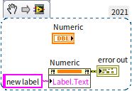
In this instance, attempting to modify the label during the program's runtime results in an error. The error message states: "This property is writable only when the VI is in edit mode". This implies that when the VI transitions from edit mode to run mode, the label property becomes unmodifiable. This raises a question: how can the property node be invoked if the VI isn't running?
It's crucial to note that a VI cannot alter the label of its own controls using a property node while running. However, a property node can be utilized to modify the labels of controls in other VIs. Thus, the label property retains its relevance and utility. The book section Changing Interface During Runtime will delve into how to effectively use property nodes and invoke nodes to amend controls in other VIs, showcasing the versatility and power of these tools in dynamic interface manipulation.
Enhancing Text with Multiple Fonts
Program Objective: Create a VI that outputs the phrase "LabVIEW is very useful!" and specifically highlights the words "very useful" to make them stand out.
This requirement involves manipulating properties related to the string control in LabVIEW. Given that only a subset of the characters in the string control – "very useful" – need to be formatted differently, the process starts with using a property node to select these specific characters. Once selected, their font style can be altered. It's feasible to adjust multiple properties simultaneously within a single property node:
In this example, the red square symbolizes a "color" constant. This constant is located within the "Programming -> Graphics and Sound -> Picture Functions" function palette. The corresponding control for adjusting this property can be found in the "Numeric" control panel.
Upon execution, the program effectively changes the font style of the designated text, thereby emphasizing the words "very useful" within the string.
Implementing Blinking Controls for Alerts
Program Objective: The goal is to create a VI that warns the operator when a specific setting exceeds a safe threshold, as it could potentially pose risks.
While there are multiple ways to signal an alert to the operator – such as changing the control's color or emitting a sound – this program focuses on a simple yet effective method: enabling the blinking property of a control.
In the provided block diagram, the program continuously monitors the value of a knob control labeled "Knob". When the value surpasses 6.1, an alert is triggered, causing both the knob and the stop button to commence blinking:
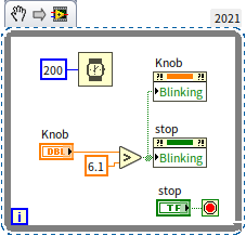
As demonstrated in the following visual, upon exceeding the set limit, the designated controls begin to blink, effectively signaling the alert:
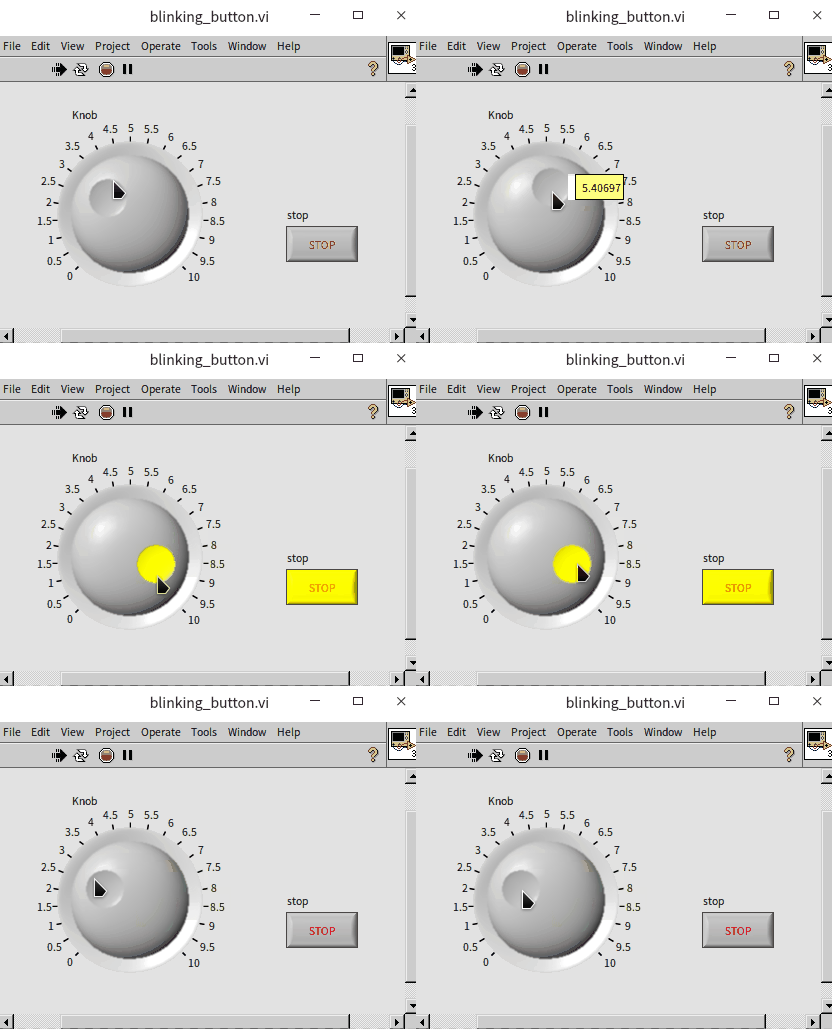
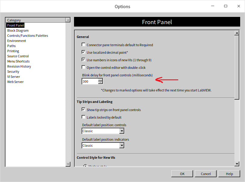
The frequency at which the controls blink can be customized in LabVIEW's settings. Access the settings by navigating to "Tools -> Options" in the VI menu. Within the "Front Panel" section of the LabVIEW options dialog box, you'll find the "Blink Delay of Front Panel Controls". By default, this is set to 1000 milliseconds (1 second). If this blink rate is deemed too slow for your application, it can be adjusted to a faster rate, such as 300 milliseconds, for a more immediate alert:
Disabling Options in Enum Controls
Program Objective: Develop a VI featuring an Enum control where certain options can be temporarily disabled during program execution.
To selectively disable options within an Enum control, LabVIEW provides a property specifically for Enum named "Disabled Items []". This property accepts an array of integers, with each integer representing the index of an option in the Enum control that should be disabled. In LabVIEW, the index count starts from 0.
For instance, if you aim to disable the second option in the Enum control (which corresponds to index 1, since indexing starts at 0), you would provide an array containing a single integer to the "Disabled Items []" property. The value of this integer would be 1, as shown below:
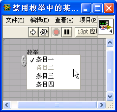
Once implemented, the program effectively disables the specified options in the enumeration control. This manipulation is reflected in the following image, illustrating the disabled state of the selected item:
Lists, Tables, and Trees
These sophisticated controls are accessible in the "Lists, Tables, and Trees" control palette:
In contrast to the simpler controls discussed previously in this book, list boxes, tables, and tree controls handle more complex data structures. Basic controls like buttons or light bulb indicators are typically used to represent straightforward Boolean data, with their primary interaction being through their values. Rarely do such controls require manipulation of their appearance or other properties via property nodes.
However, the more advanced controls such as list boxes, tables, and trees demand handling of multiple data types. For example, a list box control typically requires two distinct data inputs:
- Item Text: This is usually an array of strings, each representing the text of an individual item in the list.
- Selection Data: Depending on the control's configuration, this could be a single integer representing one selected item or an array of integers for multiple selections. In cases where one of these data types is designated as the primary data of the control, the other must be managed through the control's property node. Therefore, effectively using these controls in a LabVIEW program often involves interacting with not just their terminals and local variables, but also their property nodes to fully harness their capabilities.
In the following sections, we will delve into practical examples to illustrate how to utilize these more complex controls within your LabVIEW applications.
Configuring the Listbox Control
The Listbox control in LabVIEW has similarities to the Enum and Ring controls, but with notable differences. While the Enum/Ring control shows only the selected item, the Listbox control can display multiple items simultaneously. This feature enhances user interaction by making it easier to view and select from a range of options. Additionally, the Listbox control offers the functionality of multiple selections, allowing users to choose more than one item at a time. This selection mode can be toggled through the control's right-click menu.
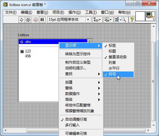
An interesting feature of the Listbox (and also applicable to tree controls) is the ability to display a small icon at the beginning of each item. To activate this, right-click on the control and navigate to "Show Items -> Symbol". This action will make the selected icon visible:
By default, these item icons are set to blank. However, you have the option to customize them for each item either by right-clicking on the item and selecting "Item Symbol" or by programming the control's "Item Symbol" property. The control provides a variety of simple icons, with approximately forty choices available:
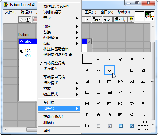
It's important to note that the last symbol in the provided image (characterized by a horizontal dashed line pattern) serves a unique purpose. It isn't an icon per se but acts as a divider. In the demonstrated list box control, this divider is used to separate the first and second items, adding clarity and organization to the list. This subtle but effective customization enhances the user's ability to navigate and understand the list's structure at a glance.
Implementing a Listbox for File Selection from a Folder
Program Objective: Create a VI that displays a list of all subfolders and files within a specified folder, enabling the user to select any item from this list.
The program utilizes a Listbox control to present the list of files and folders:
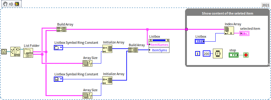
The VI is structured into two main segments:
Displaying the Selected File: A loop structure is employed to update and show the name of the file or folder selected by the user in the "selected item" string control.
Listing Files and Folders: The section left of the loop is dedicated to reading and listing all files and subfolders in the specified folder. This is achieved using the "List Folder" function, available under "Programming -> File -> Advanced File" on the function palette. This function retrieves the names of all subfolders and files, which are then displayed in the Listbox control via its "ItemNames" property.
Additionally, each item in the Listbox is assigned an appropriate symbol icon for better visual identification: folder icons are used for directories, and VI icons are used for VI files. The selection of these icons is facilitated by the "Listbox Symbol Ring" constant, located in the "Programming -> Dialog & User Interface" section of the function palette.
The program, when run, allows users to interactively choose from the listed files and folders, as demonstrated in the following animation:
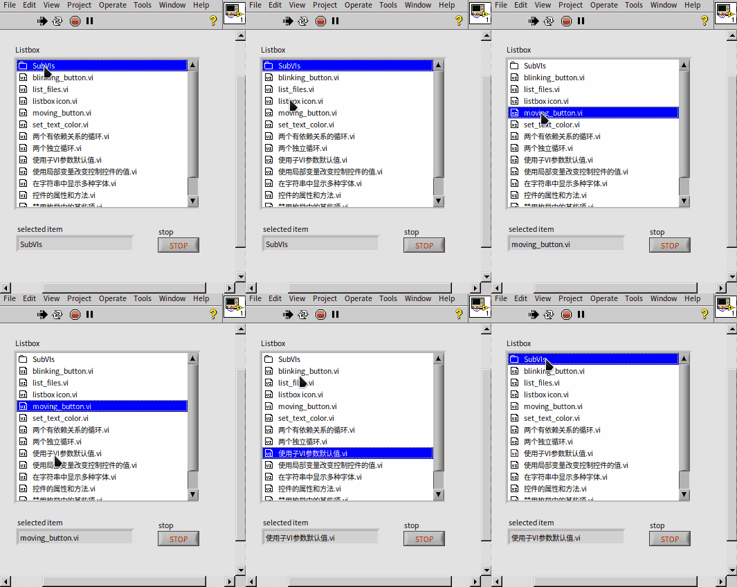
Customizing Icons in Listbox Controls
While LabVIEW offers a range of built-in symbol patterns, they may sometimes fall short in terms of variety and visual appeal. To address this, you have the option to add your own custom icons to Listbox controls, thereby enhancing the user interface's aesthetic quality.
Implementing Custom Icons: For customizing icons in a Listbox control, the "Custom Item Symbol -> Set to Custom Symbol" invoke node is used. This node facilitates the addition of personalized icons with two primary inputs:
Index: This input denotes the serial number of the icon. It's advisable to select a higher number (such as 100 or more) to avoid overlapping with LabVIEW's default symbol set. Image: Here, you provide the file path for your custom icon image.
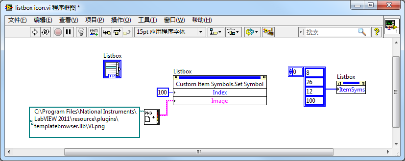
In the provided example, a colored icon (VI.png) representing .vi files is utilized. The process involves calling the "Read PNG File.vi" to load the image file, extract its data, and then apply this icon to the Listbox control. You can find the necessary VIs for handling images under "Programming -> Graphics and Sound" in the function palette. Experimentation with various images is encouraged to find the best fit for your application.
Upon implementation, the custom icon becomes visible within the Listbox control, as demonstrated in the image below. The last item in the control showcases the newly added custom icon, effectively distinguishing it from the rest:
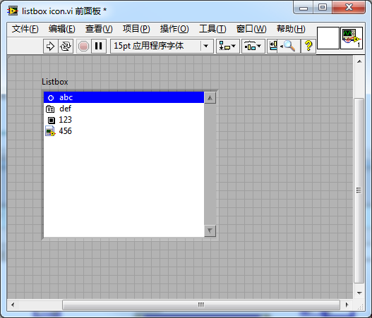
Implementing Drag-and-Drop Functionality Between Listbox Controls
Listbox and tree controls in LabVIEW offer the intuitive feature of drag-and-drop, allowing for efficient and user-friendly data manipulation. To activate this functionality, simply enable the drag-and-drop option found in the control's right-click menu:

Consider a basic program that includes two Listbox controls on its interface:

During runtime, this feature allows users to seamlessly drag and drop items between the Listbox controls:

In more complex real-world scenarios, the drag-and-drop functionality might require additional controls and restrictions. For instance, limiting the range of permissible drag-and-drop actions or incorporating specific buttons to manage the transfer of items between lists can enhance the application's usability. Such advanced user interface interactions, including how they tie into Event Structures and Program Interfaces, will be explored in more detail in subsequent sections of this book.
Highlighting Data with Multicolumn Listbox Controls
Multicolumn Listbox controls in LabVIEW are similar to standard Listbox controls but offer enhanced capabilities for handling complex data. The primary difference lies in the number of columns: while a standard Listbox has a single column, a multicolumn Listbox can display multiple columns. This makes them ideal for representing two-dimensional data tables, such as product test results or report cards.
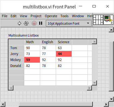
Consider the following example program that uses a multicolumn Listbox control to display a report card:

In this program, the section preceding the loop structure initializes the multicolumn Listbox control by setting its "Column Header Strings", "Row Header Strings", and "Item Name" properties. These properties define the column headers, row headers, and the data within the table, respectively. Nested loop structures are used to iterate through each data cell in the table. If any cell's data falls below 60, the "Active Cell" and "Cell Background Color" properties are employed to change the cell's background color to red, thereby highlighting the abnormal data:
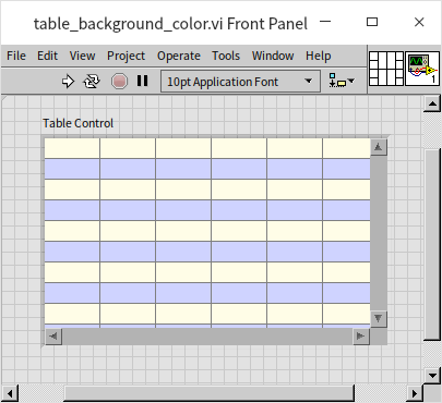
LabVIEW also offers a "Table" control, which closely resembles the multicolumn Listbox control in appearance and functionality. For instance, the following program demonstrates how the Table control can be used to alternate the background color of rows, enhancing data readability:

In this setup, the "Active Cell" is set with -2 as the column number to select an entire row. The notation -1 signifies no selection, while a value less than -1 indicates selecting all rows or columns. The resulting effect is as follows:
The data type for the Table control is a two-dimensional array of strings, identical to the "Item Name" property of the multicolumn Listbox control. This similarity underlines the Table control's focus on data presentation rather than on complex interface interactions. In LabVIEW, directly passing data to a control's terminal is highly efficient, followed by using local variables and then property nodes. Therefore, for straightforward two-dimensional data display, the Table control offers a convenient and efficient solution. However, for more interactive data manipulation needs, such as highlighting specific rows or reordering data through drag-and-drop actions, the multicolumn Listbox control is the preferred choice.
Automated Capture of Control Images in LabVIEW
While the illustrations in this book were manually captured, there are instances in programming where automatically capturing images is necessary, such as for report generation. Integrating dynamic content like waveforms or 3D graphics directly from the program interface into reports or saving them as files can be accomplished using LabVIEW's functionalities.
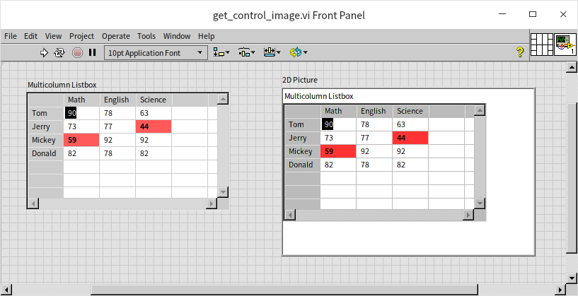
To automatically capture images of controls, the "Get Image" method is invaluable. For example, the following VI demonstrates how to use this method with a multicolumn Listbox control:

Considering that report backgrounds are typically white, it's important to set the captured image's background to white as well. This ensures consistency and prevents color mismatches in the final report. The VI uses "Draw Flattened Pixmap.vi" to transform the captured image into a format suitable for display or storage, specifically into two-dimensional image data. This data can then be displayed on the front panel using the "2D Picture" control.
Additionally, the VI incorporates "Write PNG File.vi" for saving the captured image as a PNG file. These image processing VIs are found under "Programming -> Graphics and Sound" in the function palette.
The execution result of the program demonstrates the effective capture of the control image, as shown below:
Practice Exercise
- Create a VI where the front panel displays text (e.g., "LabVIEW") along with a control for color selection. When the VI runs, the text color on the front panel should change to match the color selected by the user.