Custom Control & Enum
Enum
Before delving into Custom Controls, let's first take a moment to explore one more data type: the Enum data type. An Enum, short for enumeration, involves listing all the elements of a limited set of data. For example, take the days of the week, it's an Enum type with seven members: Sunday, Monday, Tuesday, all the way through to Saturday.
In various programming languages, Enum types are often represented by a sequence of consecutive non-negative integers. For instance, Sunday might be represented by 0, Monday by 1, and so on. While some languages permit the use of string data to represent Enum values, LabVIEW adopts a stricter definition for Enums. In LabVIEW, the values for an Enum must be consecutive non-negative integers, starting from 0. This structured approach to Enums ensures clear and consistent data representation within the programming environment.
Comparison Between Enum Controls and Ring Controls
When it comes to discussing Enum controls in LabVIEW, it's pertinent to also talk about Ring controls, as they often appear quite similar. Both these controls are accessible in the "Ring and Enum" control palette. Each type has a variety of styles available, with the two controls depicted in the image below showcasing the system style:
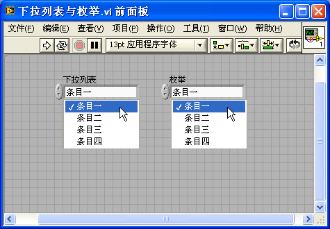
Despite their similar appearances, Enum and Ring controls are distinct in their data types: Enum controls utilize the Enum data type, whereas Ring controls are of the Numeric type. This fundamental difference in data type leads to notable variations in their behavior. Below is a table highlighting the key distinctions between these two control types:
| Control Type | ||
|---|---|---|
| Data Type | Numeric, compatible with all floating-point real number types, including EXT, DBL, SGL, I64, I32, I16, I8, U64, U32, U16, U8 | Enum, requiring a sequence of consecutive non-negative integers starting from 0, thus supporting only unsigned integer types: U32, U16, U8 |
| Setting Values | Allows assignment of any unique value to each item, without duplication. | Assigns values sequentially to each item, starting from 0 and incrementing by 1 subsequently. |
| Usage in Case Structures | Operates like other Numeric types. Conditions in case structures are determined by the value of each item, requiring manual entry of all potential conditions. | Conditions are based on the label of each item. The case structure recognizes each item in the Enum, allowing for automatic addition of branches for each Enum item via the right-click menu. |
| Dynamically Modifying Item Labels | Enables dynamic modification of item labels during program execution through control properties. | Item labels in an Enum control can be modified only in edit mode and remain unchangeable during VI runtime. |
| Strictness of Type | Uniform data type across all Ring controls: Numeric. Different Ring controls can be directly assigned to each other, even with varied items. | Enums with distinct items represent different data types. Direct assignment between different Enums is not possible; conversion to a general numeric type is required before transitioning to another Enum type. |
From the comparison above, several insights emerge:
In programming scenarios that involve representing a limited set of objects or states, Enum controls are generally more suitable than Ring controls. Enum controls, with their stricter data type enforcement, can help prevent certain types of errors within the program. Additionally, data represented by Enum controls often links to selection structures for varied processing based on distinct states or categories. Enum controls enhance a program's readability and maintainability by enabling case structures to select branches according to item labels.
Conversely, when a program needs to represent a numeric value but limit user input to specific values, Ring controls are the preferable choice.
For instance, consider a program designed to simulate an oscilloscope with three trigger modes: edge trigger, pulse width trigger, and slope trigger. In this case, an Enum control would be apt for representing the trigger mode. Similarly, if the oscilloscope has three distinct waveform amplitude levels - 0.1V, 0.25V, and 1V - these discrete values are best represented using a Ring control, which can neatly encapsulate the specific amplitude range options.
Radio Button Control
LabVIEW's radio button control (Radio Buttons) is another control type that utilizes the Enum data type, yet it differs in appearance from the dropdown-style Enum control. Radio button controls behave similarly to a set of boolean controls, but they are a unique control type within LabVIEW, allowing only one button in the set to be selected at any given time. The value of the entire radio button set corresponds to the position of the boolean control that is set to true. The appearance and the number of options of a radio button can be adjusted as required. Here are some examples of radio button controls with varying appearances:
The primary advantage of radio button controls lies in their ability to display all selectable options directly on the interface, contrasting with Enum controls which require interaction to view the available items. However, a drawback of radio buttons is that they tend to occupy more space on the interface than dropdown-style Enum controls.
Creating and Using an Enum Control
Imagine a scenario where there's a math competition with three teams: Team A, Team B, and Team C. To manage data for each team individually within a program, an Enum type control is an ideal choice. This control will represent the different teams. To illustrate the creation and utilization of Enum type controls, let's create two Virtual Instruments (VIs): a main VI, "enum_main.vi", and a subordinate VI, "enum_sub.vi".
Firstly, on the front panel of the main VI, add an Enum control. Initially, this Enum control will be blank, containing no predefined member data. To populate it, right-click on the control and use the 'Edit Items' option. This action opens a dialog box where you can input the names of the participating teams, as shown below:
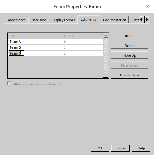
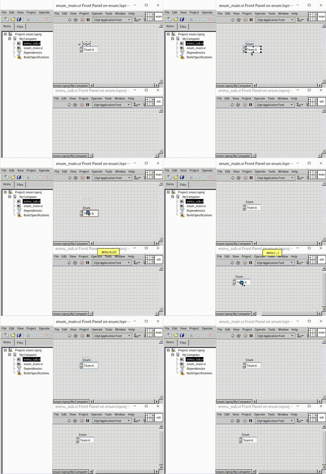
Next, consider the data processing, which is to occur in the sub VI, "enum_sub.vi". This VI must receive the Enum data, meaning it needs an input control of the same Enum type. To maintain consistency across both VIs, there’s no necessity to create a brand-new Enum control for "enum_sub.vi". Instead, simply copy the Enum control from "enum_main.vi" using Ctrl+C and paste it into "enum_sub.vi" with Ctrl+V. Alternatively, you can drag and drop the control with your mouse directly into the other VI:
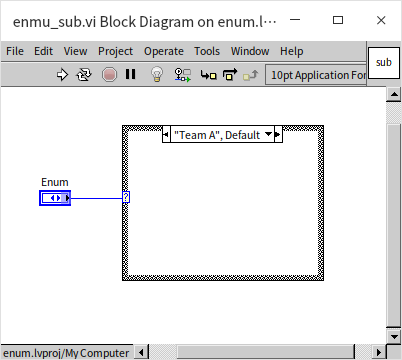
The block diagram of "enum_sub.vi" is showcased next. In this example, the focus is on demonstrating the Enum control's functionality, so the case structure does not include actual data processing logic:
The block diagram of the main VI is notably straightforward, simply tasked with transmitting the Enum type data to the sub VI:
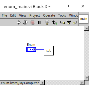
With this, our basic demonstration program is complete. However, let's consider a scenario where a new requirement emerges: Team C is renamed to Team D. To accommodate this change, we can easily update the Enum control in the main VI through the item editing dialog:
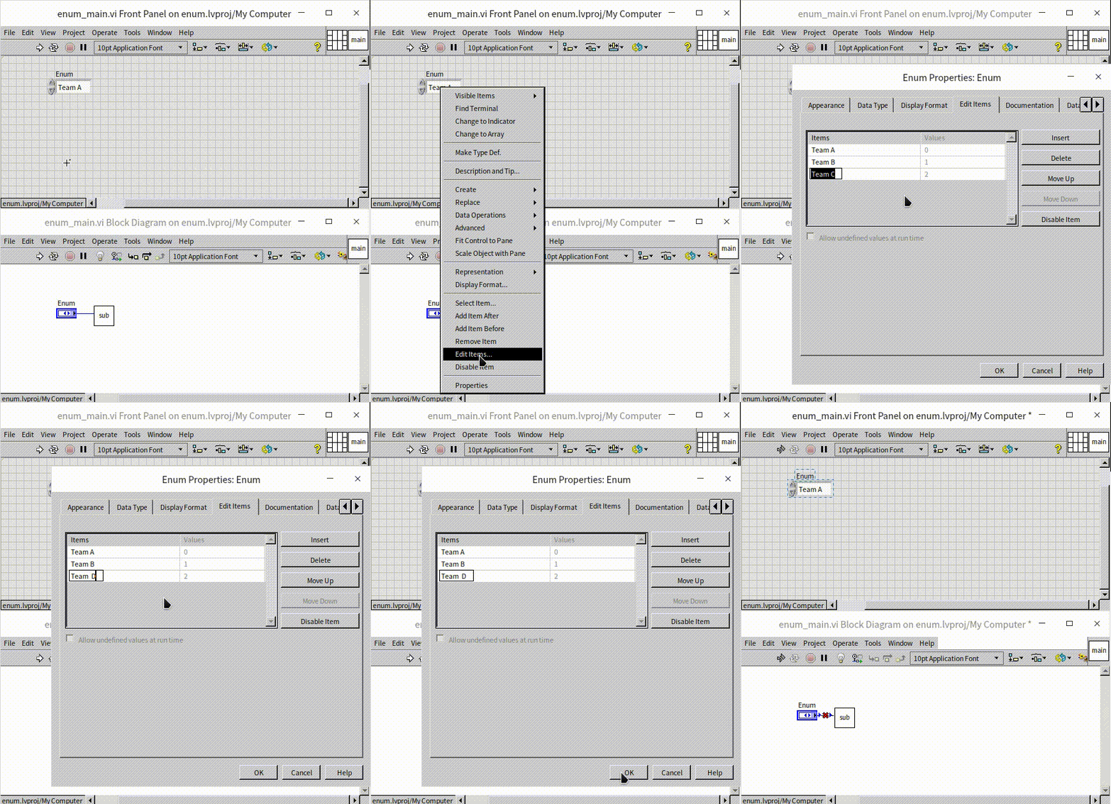
It's important to note that after altering the Enum control in the main VI, an issue arises - the main VI becomes inoperable due to an error. This complication arises because the corresponding Enum control in the sub VI remains unaltered. Consequently, the two Enum controls in the main and sub VIs now represent different data types, preventing effective data communication between them. To resolve this, one can modify the Enum control in the sub VI to match the changes made in the main VI. In our example, with only two VIs, this adjustment is fairly manageable. However, in a larger-scale project, where the same Enum control is utilized across numerous sub VIs, individually updating each control could become a laborious task.
Is there a more efficient solution for synchronizing the same data type controls across multiple VIs? Indeed, there is: by employing LabVIEW's custom controls.
Custom Control
In various projects, you might come across files with a .ctl suffix. These are known as custom controls in LabVIEW. When you open a custom control, you're presented with three distinct definition forms: Control, Type Definition (Type Def.), and Strict Type Definition (Strict Type Def.):
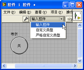
The "Control" form is typically used for customizing the appearance of a control. In contrast, "Type Definition" and "Strict Type Definition" primarily focus on defining the control's data type. Let's delve into their individual uses:
Creating a Custom Control
LabVIEW offers an extensive array of standard controls, but there are times when these might not meet the specific needs of certain applications. This is where the need for developing custom controls with unique appearances arises. The challenge in crafting such controls often lies more in the realm of creativity and artistic design than in programming. To embark on this process, start by gathering the essential elements, such as visually appealing images. These images are then used to replace the default imagery of LabVIEW controls, allowing for a customized, aesthetically enhanced user interface.
custom controls in LabVIEW are primarily designed to modify the appearance of an existing control without changing its underlying behavior. Essentially, these controls are adaptations of existing LabVIEW controls, tailored to meet specific aesthetic requirements. However, if your objective is to create an entirely new control with functionalities distinct from those available in LabVIEW, you should consider employing the XControl technology. The intricacies of XControl will be explored in greater detail in subsequent chapters of this book.
Take, for example, the creation of a "Back Button" – a button symbolized by a left arrow ( ). This can be achieved by using an existing LabVIEW button as the base and customizing it to fit the desired appearance.
When setting out to create a custom control, the first step is to generate a .ctl file. There are two main approaches to this:
Navigate to "File -> New -> Custom Control" in the menu. This action creates an empty .ctl file, to which you can then add a standard LabVIEW button control and modify as needed.
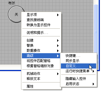
Alternatively, right-click on an existing control within a VI's front panel and select "Advanced -> Customize". This method generates a .ctl file based on the selected control:
The interface of a .ctl file closely resembles that of a VI's front panel. It's important to note that only a single control is permitted within this interface. Should there be no control or more than one, an error indicator will be displayed on the toolbar:
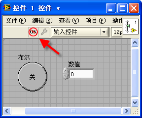
In addition to the primary control element, the custom control panel can incorporate various decorative graphics and text labels. Since a .ctl file lacks a block diagram, it serves exclusively to define the appearance or data type of a control, without influencing its functional behavior.
Components of a Custom Control
In LabVIEW's custom control panel, there is an identifiable button adorned with either a wrench or tweezers icon. This button allows users to switch between two distinct modes: "Edit Mode" (wrench icon) and "Custom Mode" (tweezers icon). In Edit Mode, users have the ability to adjust the control's size, color, and various other attributes, a process akin to altering control properties directly on a VI's front panel. Conversely, Custom Mode offers a more in-depth customization experience, enabling users to deconstruct the control into its constituent parts for comprehensive modifications, thereby enabling a complete transformation of the control's visual presentation.
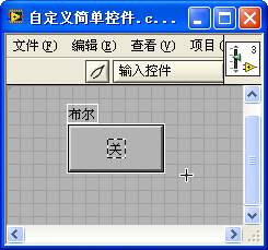
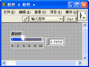
Within Custom Mode, each detachable segment of a control is framed by a white border, aiding in the identification and separation of different components. It's important to note that various controls are composed of distinct elements. For example, a basic button might consist of just a label, the button's main body, and boolean text. On the other hand, a slider control is significantly more intricate, incorporating elements such as a label, movement buttons on both left and right sides, distinct background colors for each side, the slider itself, a scale, a background border, a numeric display, a unit label, among others:
Modifying Control Components
Imagine you are tasked with designing a control that resembles a web browser's back button. Before you begin modifying the custom control, it's necessary to have the appropriate image file at your disposal. For instance, consider the following image prepared for a button:
A straightforward approach to customization involves using this image to substitute the control's original boolean text. While in Custom Mode, right-click on the boolean text area of the button and opt for the "Import from File..." selection:
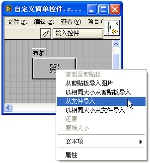
Proceed to select the prearranged image file. By doing so, you effectively replace the original component of the control with the newly imported image:
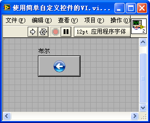
Utilizing this method, the button acquires an appearance reminiscent of button styles prevalent prior to Windows 2000. To craft a borderless, round button, simply overlaying a round image onto the boolean text of a square button isn't sufficient. Instead, the main body of the template control should be replaced with the circular image. The process involves specific requirements for the image:
Image Shape and Transparency: Although the desired button shape is round, image files are inherently rectangular. Consequently, the image used should feature a single circular pattern, with the surrounding area being transparent. PNG files are particularly suitable for this purpose due to their excellent support for transparency, making them the ideal choice for crafting button materials.
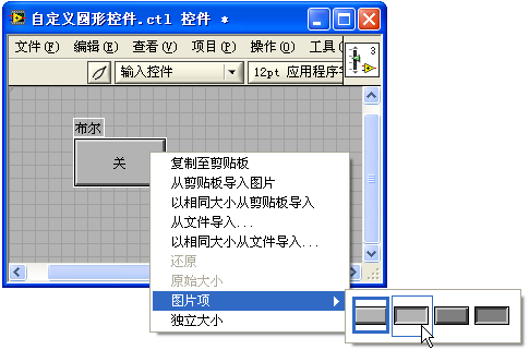
Image States: For the main body of the button, different images are needed to represent various states: true, false, transitioning from true to false, and vice versa. In the case of a trigger-type button, only two states are necessary: the normal state and the mouse-down state. Accordingly, two distinct images are used in this example: one for the regular state and another, darker one for when the button is pressed:
When in Custom Mode, right-clicking on the main body of the control reveals options such as "Import Image from Clipboard" and "Import from File". These functionalities enable you to swap out the current visual state of the button control. The "Image Items" option in the right-click menu allows you to navigate between the button's various states and update each with the corresponding image:
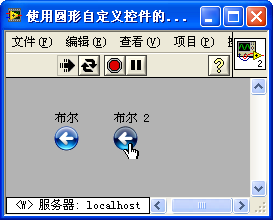
The mechanical action for this custom control should be set to "Switch When Released". The image below demonstrates how it appears within an application, showcasing "Boolean 2" in its pressed state:
Simple Animation
LabVIEW offers support for GIF format graphic files, known for their unique capability to display animations. Incorporating these animated images into controls can add dynamic visual effects. For example, consider a small square block I created, which features a color-changing animation: ![]() . This GIF image can be used innovatively, such as replacing the slider thumb in a slider control:
. This GIF image can be used innovatively, such as replacing the slider thumb in a slider control:
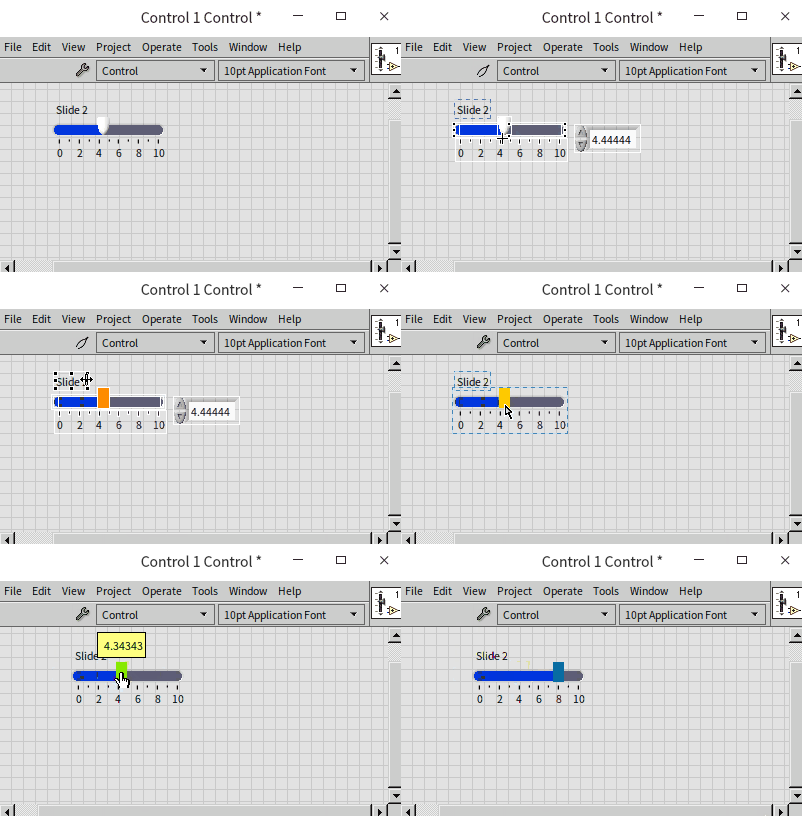
By implementing this method, the slider control is enhanced with an eye-catching animated effect. Additionally, for scenarios where simple animation display is required without the need for user interaction, GIF images can be directly dragged or copied onto the front panel of a VI. This integration results in the VI's interface showcasing lively animated content.
It's important to note that GIFs are typically suited for simpler animation tasks. However, for those interested in more sophisticated animation capabilities within LabVIEW, the later sections of this book will delve into advanced techniques and methods to achieve more complex animation effects.
Type Definition
To elucidate the various forms of custom controls in LabVIEW, it's essential to understand a key concept: Controls defined in .ctl files are referred to as “custom controls,” whereas controls created by dragging or opening a .ctl file onto the front panel of a VI are known as “instance controls.” custom controls come in three different forms: "Control", "Type Definition" (Type Def.), and "Strict Type Definition" (Strict Type Def.).
Controls that merely alter appearance and are saved in the "Control" definition form are considered unassociated custom controls. In other words, there is no linkage between the custom control and its instances. For instance, creating a visually appealing button control and saving it in a .ctl file allows you to generate its instances on the front panel of a VI by simply dragging or opening the .ctl file. Once an instance is created, it becomes independent of the original custom control. Any modifications made to the instance on the VI's front panel or to the custom control within the .ctl file will have no impact on one another.
In contrast, when a control is set as a Type Definition, the data type of its instances becomes inherently linked to the custom control. Should the data type within the Type Definition undergo a change, all corresponding instances across VIs will automatically update in sync. For example, if a control within a Type Definition is altered from an I32 numeric control to a boolean control, every instance of this Type Definition in various VIs will seamlessly transition to boolean controls:
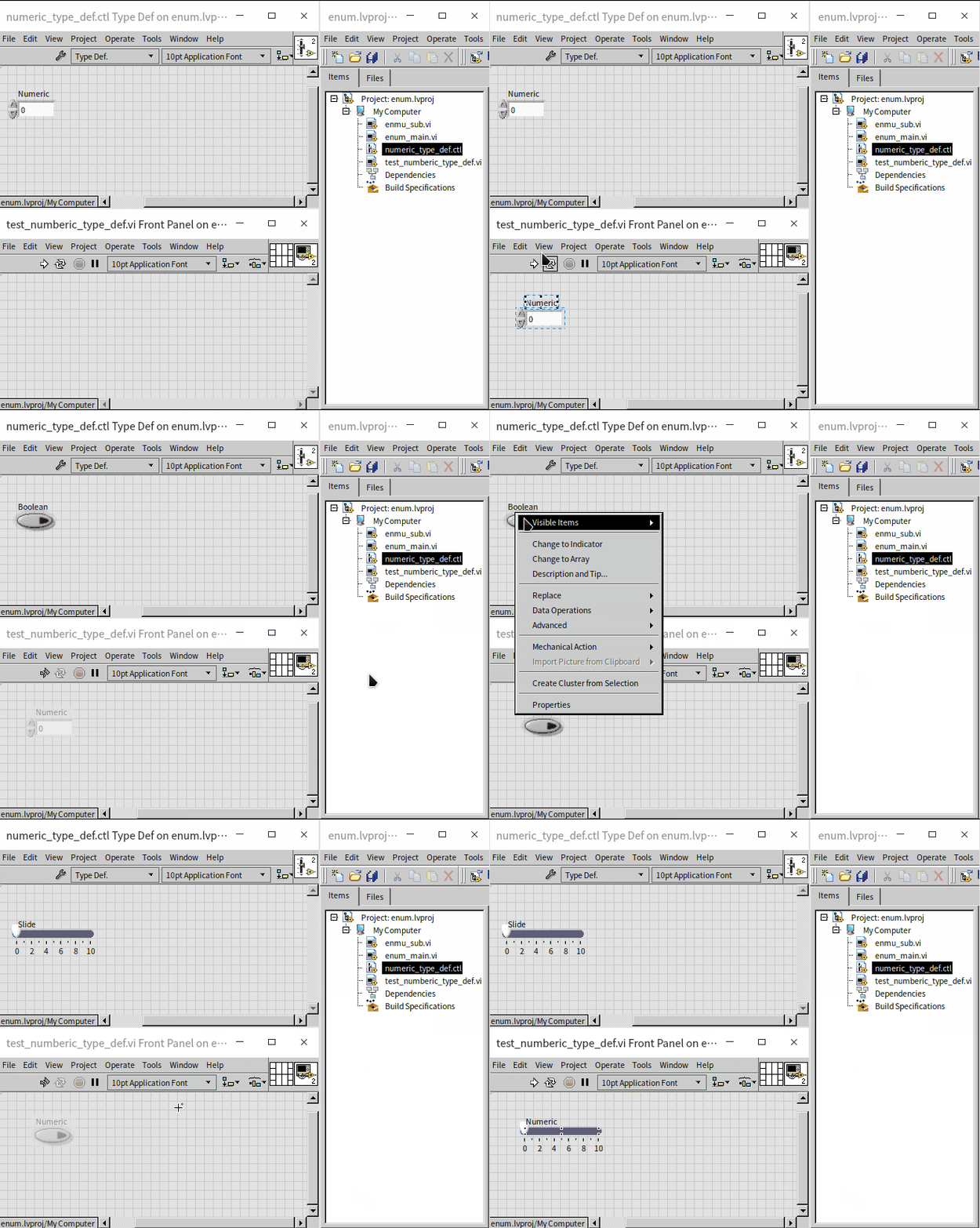
It's crucial to note that instances will only auto-update when there's a change in the data type of the Type Definition control. Alterations that do not affect the data type, such as changes in appearance or properties like color or numeric range, will not trigger an automatic update in the instances. This limitation can occasionally be a drawback. For instance, if a Type Definition is used for a dropdown list control and an item is added or removed, it would be ideal for the instances to update automatically to reflect these changes. However, this is not the case, necessitating the use of a strict Type Definition for scenarios requiring such dynamic updates.
Strict Type Definition
Strict Type Definitions in LabVIEW function similarly to regular Type Definitions, but with a critical distinction: when employing strict Type Definitions, the data type, appearance, and most attributes of instance controls are bound to remain in sync with the custom control. This alignment extends to various aspects of the control, with the exception of certain specific properties like value, default value, label, and documentation, which can retain individual settings for each instance control.
For complex data types such as clusters, dropdown lists, enumerations, etc., it is highly recommended to utilize strict Type Definitions. This practice ensures uniformity and consistency across all instance controls within a program, maintaining coherence in the program's design and function.
A common misconception about strict Type Definitions is that they influence only instance controls and not the properties of instance constants. Instance constants are defined as constants linked to a .ctl file, created on a program’s block diagram via dragging or generating constants. For example, if you modify a dropdown list control within a strict Type Definition by adding a new item, this change will reflect in all related instance controls. However, instance constants will not automatically adapt to these modifications and will not display the new item. Despite expectations for constants to auto-update, they remain unaffected by these changes in reality.
When a strict Type Definition is updated, all corresponding instance controls in the program are automatically updated as well. However, it's important to note that certain aspects of the program's code may require manual adjustments. For instance, if a new item is introduced to a dropdown list control, additional programming may be necessary to implement corresponding branches or functionality to accommodate this new element.
Practice Exercise
- Consider a scenario where you need to represent the coordinates of a point on a plane, specifically the x and y coordinates, within a cluster. Your task is to create a strict type definition for this coordinate cluster. Then, develop a VI where the data input control type is the newly created custom control. Within this VI, display the input coordinates on an XY graph control. Subsequently, enhance the type definition in the cluster by adding a z element, enabling it to represent a point's position in a three-dimensional coordinate system. Observe and analyze whether the input control in the VI adjusts synchronously with these changes.