Data Display
In the section on graphical data display covered earlier, we detailed methods for showcasing waveform data in LabVIEW. This section focuses on some specialized approaches for displaying test and measurement data.
Interrupted Curves
There are scenarios where you might need to draw curves with interruptions. For instance, imagine a signal present from 0 to 1 second, absent from 1 to 2 seconds, and then reappearing from 2 to 3 seconds. The goal is to avoid displaying the curve during the 1 to 2 seconds interval.
Merely setting the waveform data values to 0 for the 1 to 2 seconds interval won't meet this requirement. Doing so would cause the graph to draw a horizontal line at Y-axis equal to 0. The solution is to use "NaN" (Not a Number) values to represent parts of the curve that should not be displayed. If a data point in the waveform is NaN, it will not be plotted on the graph.
To achieve the aforementioned functionality, any part of the program with values less than 0 should be set to NaN. This approach will display only those parts of the sine curve that are greater than 0, effectively hiding parts less than 0. Below is the block diagram for the program:
Here's the outcome:
This method can be extended to draw a "single" curve that changes colors. For example, a program requirement might be to draw a sine curve where the part above 0 is depicted in red and the part below 0 in green. This can be accomplished by drawing two curves on the waveform chart control, one red for the portion of the sine curve above 0 and the other green for the portion below 0. The two curves seamlessly join, creating the illusion of a single curve with two colors.
Displaying Large Amounts of Data
Some data acquisition devices have extremely high sampling rates, capturing millions or even billions of data points within a brief period. Displaying all this data directly on a waveform chart is not practical. It's time-consuming due to the volume of data to be rendered.
In reality, a screen cannot display too much information at once. For instance, on a 1024x768 resolution screen, if it's wholly utilized for a waveform display, there are only 1024 points available horizontally. This means, at most, only 1024 data points of a curve can be shown at any time. Thus, loading all the data into a waveform chart at once makes little sense. For efficiency, only data equivalent to the display resolution should be fed into the waveform chart for rendering.
To maintain the original waveform's shape, the displayed data should be uniformly sampled from the original dataset. For example, if the original data contains 100,000 points and the screen can only display 200 points at once, one could extract every 500th point from the original data to create a new dataset for display:
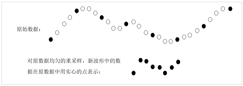
Handling large amounts of data is one of the main factors leading to low program efficiency. Reading huge volumes of data from the disk and resampling them are time-intensive tasks. If a large file needs to be frequently loaded into memory and displayed, it might be more efficient to save a resampled, reduced version of the file as well. This way, when the complete dataset needs to be displayed, the program can load the reduced version, eliminating the need to read and resample the larger file.
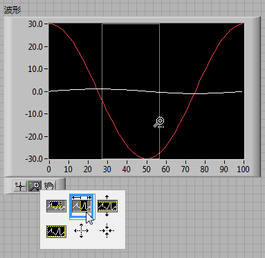
While the resampled data retains the overall appearance of the original dataset, it loses detail. If a user attempts to zoom in on a section of the waveform for a closer look, the reduced dataset won't suffice because it can't show the waveform's finer details. At this juncture, the program must recalculate the display area and waveform resolution, generating a new set of resampled thumbnail data.
For instance, consider data meant to be displayed at a sampling rate of 10,000, meaning 10,000 points are collected every second. The original data spans 10 seconds, with a total of 100,000 points. The waveform chart can display 200 points at a time. Initially, for displaying the entire dataset, every 500th point is extracted to form a new dataset. This new dataset has a sampling rate of 20, still covering a span of 10 seconds, but consists of only 200 points.
If, after viewing the entire waveform, a user decides to zoom in on data between the 3rd and 4th seconds, the portion displayed needs to focus on the original data's 3,000th to 5,000th points. These 2,000 points also do not need to be entirely displayed on the waveform chart; they can be resampled at a rate of 100. Thus, the resampled data still consists of 200 points but represents the original data's contents for the 2nd and 3rd seconds.
High-Speed Data Display
In some testing scenarios, programs are required to simultaneously collect and display data, allowing users to observe the results in real-time. When the data collection speed is modest and data change frequency is manageable, it’s straightforward to use waveform chart controls for data display.
However, when data collection speeds are exceptionally high, with sampling rates reaching tens of thousands of points per second, feeding all collected data directly into waveform chart controls would result in attempting to display tens of thousands of points every second. Such a rapid refresh rate would be impossible for human eyes to discern each frame. To reduce the refresh rate for display purposes, the sampling rate of the data meant for display can be reduced, for instance, to about 10 points per second before being shown on the waveform chart controls. This way, the movement of the waveform doesn’t appear too fast, allowing observers to clearly see the changes.
This approach is akin to the method used for handling large volumes of static data for display. Its downside, similarly to the static data handling, is its inability to showcase the finer details of the waveform. Yet, the rationale for employing a high sampling rate in data collection is specifically to capture these waveform details. If the collected signal is irregular, one might opt to display a small segment of the signal, such as 0.001 seconds worth of data, at the original sampling rate. The image could remain visible for a second, giving the observer enough time to see it clearly before displaying the next 0.001 seconds of recently collected signal. Although this method does reveal the details of the image, it effectively allows the observer to see only 0.1% of the data, missing out on the remaining 99.9%.
Most of the time, the signals being monitored are regular, periodic signals. Since periodic signals are repetitive, ensuring that each frame displayed on the waveform chart begins at the same point in the signal's cycle means each displayed image will be almost identical to the previous one. This allows for increasing the image refresh rate while keeping the waveform stable and free from irregular flickering. For instance, refreshing 20 frames per second with this method allows for displaying 20 times more data than the previous method. This way, it is possible to both reveal the details of the waveform and display more data, mirroring the operation of an oscilloscope:
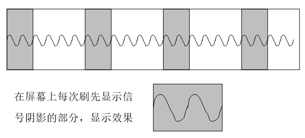
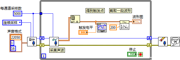
The key to stabilizing image display with the oscilloscope method is ensuring that each frame starts from the same point in a signal's cycle. This can be accomplished by setting a trigger point to guarantee capture of the same point in each cycle. After identifying the trigger point, a consistent segment of the waveform is extracted for display.
Below is an illustration of a simple oscilloscope using a sound card to collect and display audio signals. In its operation, it first reads sound signals from the sound card, then identifies the trigger point based on a predetermined trigger level. A segment of the waveform following the trigger point is then extracted for display:
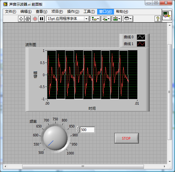
In testing this VI while also generating a square wave through speakers, the sound card oscilloscope displays the audio signal. The subsequent image shows the display effect of the sound card oscilloscope. The original square wave signal is also integrated. The irregular periodic signal in the image is the sound signal captured by the oscilloscope's microphone. Due to the low quality of the audio system, the signal completely deforms by the time it travels from the speaker and is recaptured by the microphone. However, it's still apparent that the signal is stimulated by the square wave. Adjusting the square wave's frequency and amplitude leads to corresponding changes in the captured signal:
Selecting a Curve with the Mouse on a Waveform Chart
Users often need to perform complex operations on curves within a waveform chart using the mouse. For the program to identify which curve the user has clicked on, it can utilize the waveform chart control's "Get Plot at Position" method. This method takes a coordinate as its input and returns the index of the curve near that point, or -1 if no curve is found.
The example program below illustrates how to use this method to detect and thicken the curve clicked by the user.

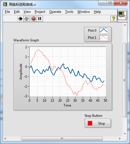
In this program, after initializing by drawing two random data curves, it waits for a user click on the waveform chart. Upon detecting a click, it invokes the "Get Plot at Position (GetPlotAtPos)" method to check if the click was on a curve. If so, the curve's thickness is increased to 2 using the "Plot.LineWidth" property node; otherwise, it remains at its original thickness of 1.
The effect of the program's execution is demonstrated below, where Plot0 has been thickened after selection:
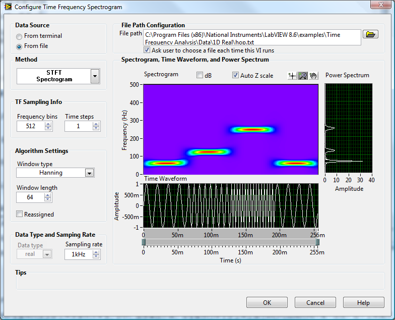
Time-Frequency Spectrogram Analysis
The "Advanced Signal Processing Toolkit" significantly eases the process of signal processing, offering a variety of functions and tools for time-series analysis, time-frequency joint analysis, and wavelet analysis.
For example, the time-frequency analysis operation discussed in Graphical Display of Data can be efficiently performed using the "STFT Spectrogram" Express VI from the toolkit. This toolkit also introduces other time-frequency analysis methods not available in LabVIEW, such as Gabor Spectrogram and Adapt Spectrogram. Additionally, it provides the capability to further process the generated time-frequency spectrogram, like isolating signals from a specific segment of the spectrogram.
