Principles of UI Design
Some program interfaces immediately dazzle users upon launch, perhaps due to their innovative and lavish design. However, a visually striking interface does not automatically signify a well-functioning one. The primary benchmarks for evaluating an interface's quality are, firstly, its functionality - can users efficiently provide necessary information to the program and receive the information they need in return? Secondly, the ease and intuitiveness with which users can input or access information are crucial. The aesthetic appeal of the interface is considered last.
From this standpoint, a well-designed interface ought to feel instinctive to users without drawing undue attention. Often, if an interface captures attention, it might be because users find it visually uncomfortable or because they struggle to locate required information or input fields.
When developing a project or software with LabVIEW, the typical workflow involves five steps: gathering requirements, designing, coding, testing, and deployment and maintenance. During the design phase, a project might necessitate various design aspects, including user interface design, program structure design, interface design, and module design. Starting with the user interface design in LabVIEW programming is common practice. Prioritizing interface design ensures it remains uninfluenced by the constraints of program implementation. Designing the program structure first can lead programmers to prioritize coding simplicity over interface usability, often resulting in interfaces that are not the most convenient for users.
Designing and programming user interfaces with traditional textual languages usually requires drafting prototypes on paper first. LabVIEW possesses a unique advantage in this area with its visual programming environment, which greatly facilitates the creation of interface prototypes. With its extensive selection of readily adjustable controls, LabVIEW enables users to draft interface designs simply by dragging and dropping controls.
Perceptions of what constitutes a good or bad interface can differ widely. Beauty is in the eye of the beholder, as is wisdom. Nonetheless, high-quality user interfaces often share common characteristics, such as consistent design, proper use of data and control types, logical and streamlined control layout, and ease and convenience of user operations. Programmers should thoughtfully incorporate these elements when designing program interfaces.
Consistency
A crucial characteristic of a user interface that facilitates quick adaptation and ease of use is its consistency. The term "consistency" here spans several dimensions.
Internal Program Consistency
Different software caters to varied application domains and target audiences, each adopting a unique style. For instance, software designed for children, like the LEGO edition of LabVIEW, might feature cartoon imagery to make it appealing and fun. Software targeted at young adults could use bright colors to appear vibrant and energetic. Most LabVIEW applications, being utilized in industrial settings and aimed at professional users, should opt for a subdued, simplistic design that underscores their professional utility.
No matter the style chosen, the various interfaces within a program—such as different dialog boxes—and the different controls on a single panel, should adhere to a consistent style. Using a uniform style across the board can give users a sense of harmony and cohesion.
As illustrated below, opening LabVIEW's control palette reveals controls in several distinct styles: Classic, Modern, and System.
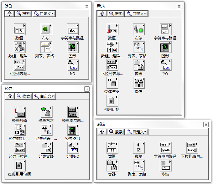
Controls in the Classic style may seem somewhat dated; they were the standard in versions of LabVIEW prior to LabVIEW 6. Apart from two specific scenarios, this style has largely fallen out of use.
One scenario involves maintaining legacy programs. If an older program was originally designed using Classic controls, and there is a need to keep the interface style consistent without the intention to invest time in revamping the original interface, then Classic style controls would still be necessary.
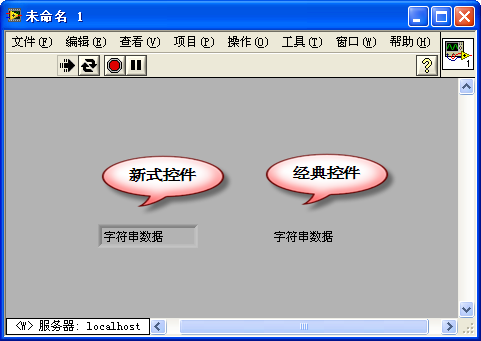
The second scenario is when you need to design a transparent control. In LabVIEW's interface design, setting control backgrounds and borders to transparent can unlock various special effects. This application will be explored in more detail with later examples. For now, let's consider a simple case: if you need to display instructional text on the interface while the program is running, but you don't want the string control's borders to be visible, you can set both the border and background of the string control to transparent.
To do this, click on "View -> Tools Palette" from the menu to open LabVIEW's tools palette. By selecting the "Color Settings" tool at the bottom of the palette and choosing the transparent color option in the top right corner, you can make the background and border of the string control transparent.
For modern and system style controls, certain parts cannot have their colors changed, necessitating the use of classic style controls for full transparency:
With the introduction of LabVIEW 6 and later versions, a range of aesthetically pleasing controls featuring a three-dimensional effect, known as modern style controls, became available. These controls are particularly suitable for software developed for the testing domain.
System style controls align with the look and feel of the operating system. Using these controls for your interfaces ensures consistency with the native style of the system, which users tend to readily accept. These controls automatically adapt to different operating systems and their settings. For instance, if a program is transferred to a Mac OS machine, text boxes will automatically switch to the Mac OS style with rounded corners. Similarly, if the system color scheme is set to high contrast, text boxes will adapt to a black background with white text.
However, certain LabVIEW-specific controls, like the waveform display controls, lack a system style option. If your program predominantly uses system style, you might need to tweak the colors of these specific controls to keep them in harmony with the system's color scheme.
In LabVIEW 2011, a new "Silver" style set of controls was introduced, aligning with contemporary design trends. When crafting applications, making use of the "Silver" series can lend a modern flair to your interface.
Adhering to Established Conventions
There are numerous design and operation methods that might not be the most visually appealing or the most optimized, yet they have been broadly accepted by the public and are therefore challenging to change.
Take, for instance, our current keyboard layout, which was intentionally designed to slow down typing speeds. Despite its inefficiency, it has become so ingrained in our habits that few people would switch to a different layout just for the sake of increased typing speed.
Similarly, certain classic operations associated with system software, like using Ctrl+C for copy and Ctrl+V for paste, have become universally accepted standards. Attempting to repurpose these shortcuts for tasks you might deem more fitting would likely not be well-received by users.
In terms of application interfaces, the most familiar setup is arguably the Windows default style: windows with a title bar at the top, a menu below it, followed by a toolbar, the main content area, a status bar at the very bottom, and scroll bars to the right and at the bottom. Deviating from this familiar arrangement, such as swapping the positions of the title bar and scroll bars, would undoubtedly make the interface feel unintuitive. For example, Microsoft's Office 2007 underwent a significant makeover in terms of interface style, becoming much more visually appealing. However, the rearrangement of many commonly used menus and buttons required users to reacquaint themselves with a new layout. As a result, after the release of Office 2007, many users preferred to stick with the older versions of Office software with which they were already comfortable.
LabVIEW's default color scheme and control style are somewhat different from those of the system. Hence, to make things easier for new users, it is advisable to utilize system-style controls and color schemes in your programs wherever possible.
Aligning with Real-World Analogues
Many applications aim to simulate or replicate real-world environments. For user interfaces to be easily accepted, they should closely align with real-world counterparts.
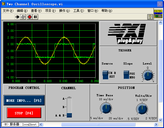
Programs developed in LabVIEW are often related to measurement and control. In these domains, certain widely recognized instruments or devices have become ingrained in user familiarity. Thus, software interfaces can draw design cues from these instruments. For instance, if a program is intended to mimic an oscilloscope, its interface should resemble that of a traditional oscilloscope as closely as possible: featuring a waveform display on one side, with knobs and switches for adjusting vertical and horizontal scales surrounding it. This design approach ensures that anyone who has previously used an oscilloscope can intuitively operate the software.
Below is an example from LabVIEW's built-in examples. Despite its design utilizing older-style controls, which might not match the aesthetic softness and appeal of modern interfaces, it achieves consistency with actual oscilloscopes in control appearance, layout, and operational methods, mirroring the real-life buttons and knobs on oscilloscopes. As a result, users familiar with oscilloscopes can typically operate this VI's oscilloscope-like functions without needing to refer to the VI's help documentation.
Establishing and Adhering to Interface Standards
A key to maintaining interface consistency is the observance of specific design standards during development. These standards detail the program interface's aspects, such as uniform color for all dialog boxes, consistent button sizes, and standard font size for all text.
Standards can be defined internally by an organization or adhere to established industry norms. For programs designed in the style of the Windows operating system, Microsoft's interface standards offer a guideline. Microsoft hosts a comprehensive introduction to Windows program interface standards on its http://www.msdn.com website. For LabVIEW programs, the LabVIEW Program Development Standards provide a framework. The "LabVIEW Development Guidelines: LabVIEW Style Guide (Chapter 6)" document, available on http://zone.ni.com/devzone/cda/tut/p/id/4434, outlines specifics like panel colors, font sizes, and control arrangement guidelines for LabVIEW applications.
Association of Interface Elements
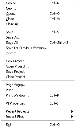
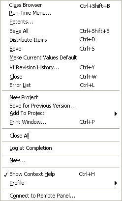
The images above compare two menus: one from LabVIEW and another creatively designed by the author. It's reasonable to assume most readers would prefer the first menu, which is neatly organized and logical.
The denser the interface with elements, the longer it takes to locate specific information. When users identify an element related to their search, they expect it to provide guidance, helping them find what they're looking for more quickly. Thus, interfaces need clear cues indicating which elements are related and which aren't.
Various methods can showcase the relationships between interface elements, including their arrangement, borders, whitespace, colors, and fonts.
People tend to look for information near content that appears related. Therefore, controls or items that are logically connected should be positioned close to each other on the screen. For instance, related items like "Save", "Save As", "Save All" in the menu mentioned are grouped together.
However, merely placing related content in proximity isn't sufficient. Consider the illustrations below:
This represents a classic joke circulating on the internet: A teacher is distributing homework and calls out names written on the books: "Yellow Belly" and "Fish Is Worm", but receives no answer. Eventually, two kids haven't received their books, revealing their names are actually "Huang Yupi" and "Lu Dan". While the kids ordered the interface elements sequentially, they failed to logically group them, leading to a humorous misunderstanding.
In a menu containing more than twenty items, simply grouping related items together may still not be user-friendly. A better approach is to organize them into different functional zones. For instance, separating file-saving operations from project operations with a divider can clarify their distinct functionalities.
This principle also applies to panel controls. Grouping functionally related controls together, whether through borders, dividing lines, or varying spaces, helps users intuitively understand their close functional connections.
Color serves as another way to signify the relationship between controls. For example, on a sports field, team members are easily distinguished by their uniform colors once the spatial arrangement dissolves with the start of the game. This logic can similarly guide interface design by assigning distinct colors to controls based on their functions.
However, it's crucial to use color only as a secondary method. It should be reserved for instances where the other methods are not feasible. People's preferences for interface color richness vary significantly. While a neatly organized, logically structured interface is universally preferred, an overly colorful one is not. Interfaces with bright, contrasting colors can lead to visual fatigue and even discomfort for some users.
LabVIEW's color configuration panel is segmented into various color zones:
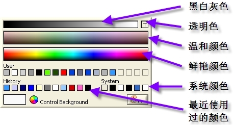
When designing in a system style, it's essential to use system colors. Otherwise, opt for soft colors over bright, flashy ones. Interface color schemes should also be considerate of users with color blindness or color vision deficiencies.
For interfaces with minimal content, it's wise to limit the use of multiple colors. Color diversity is more beneficial when dealing with interfaces that contain a large amount of information. For instance, in texts where differentiating between various segments is necessary (like highlighting spelling mistakes or identifying different word types), colors can help distinguish these elements. However, even in such cases, employing different fonts or font sizes can achieve a similar distinction without relying on color.
Providing Help and Feedback
Designing user interfaces requires special consideration for new users. To aid their understanding of the interface's functionality, ample help or guidance should be readily available. LabVIEW offers several avenues for delivering this information, including user manuals, the Context Help window, tooltips, descriptive titles and option texts for controls, and embedding help text directly on the interface.
First and foremost, it's essential to use control names that are meaningful and easily understood. Consider the control depicted below, which is designed to specify the trigger condition for a signal: either the rising or falling edge. If this control lacks a name or is given a vague label like "Mode", it fails to convey its purpose effectively. A more descriptive label like "Edge Trigger Mode" significantly aids user comprehension.
However, a title alone may not suffice. This control, representing two possible values, is best depicted as a Boolean. But users might be unsure whether "True" indicates a rising or falling edge. Thus, displaying the Boolean text that describes the current state can instantly clarify the control's function and its present setting.
Tooltips are another widely utilized feature in software. Setting up a control's tooltip means that when users hover their mouse over it, a small yellow box appears near the cursor, revealing pre-defined help information. Additionally, LabVIEW's Context Help window can showcase even more detailed assistance. Compared to tooltips, the Context Help window offers more space for in-depth information.
To add explanations and tooltips to a control, right-click on the control and select "Description and Tip." This action opens the "Description and Tip" dialogue:
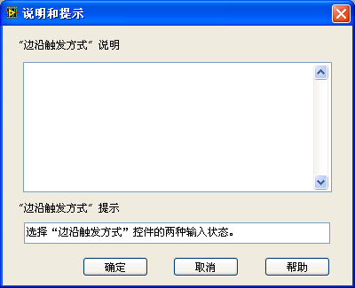
In the dialogue, the upper field is for entering information displayed by the Context Help window, while the lower field is for the text shown in tooltips.
It's worth noting that the Context Help window's capacity is somewhat limited. Overloading it with information can consume too much screen space, potentially disrupting the program's display or detracting from the interface's overall aesthetic.
If further detailed assistance is required, it might be necessary to direct users to a user manual or dedicated help documentation. LabVIEW's help documentation is accessible through "Help -> Search LabVIEW Help" in the menu. It's important to clearly indicate on the interface that users can refer to the user manual for more information:
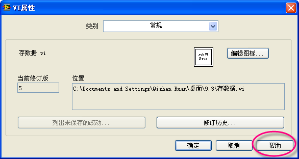
In LabVIEW programs, it's common to include links to relevant information in the Context Help window:
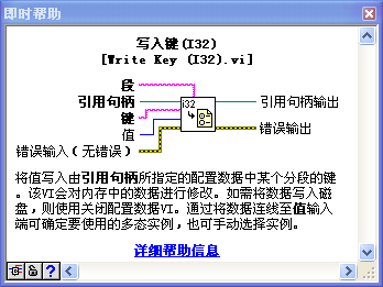
For interfaces that are infrequently accessed—such as configuration screens that might only be used once every few years—do not expect users to recall the purpose of each item. If the interface does not need to be overly streamlined, including help information directly on the interface itself can be beneficial.
Consider the "Tools -> Import -> Import Shared Library" tool as an example. The image below displays one of its interface pages, where the primary user decision involves selecting an "Error Handling Mode". Given the infrequent use of this setting, its description should be as comprehensive as possible, even if it occupies a substantial portion of the interface. In this case, to enhance understanding, demonstration images are also integrated into the interface.
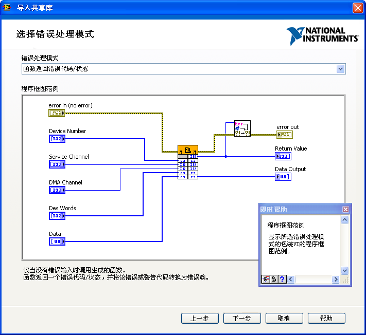
The text at the bottom of the interface offers detailed explanations for the various error handling modes, adjusting dynamically based on the user's selection. The center part of the interface features an illustrative diagram for the option. Pressing Ctrl+H activates Context Help, providing explanations for each interface element. If users seek even more detailed information, they can click the help button located in the interface's bottom-right corner to access the help documentation for an in-depth explanation.
Implementing Constraints
Ensuring software reliability falls under the purview of developers. In instances where users might make operational errors or input incorrect data, a robust program should be capable of halting further execution and reporting the error. However, addressing issues after they arise is less than ideal. A superior approach is to prevent misoperations and incorrect data inputs from occurring in the first place.
Designing an interface thus requires consideration of how to limit incorrect inputs and operations by preventing errors and ensuring all data inputs fall within acceptable ranges.
Restricting Input Data
Certain LabVIEW controls come with built-in functionality to limit input data. For example, numeric controls allow you to specify the range of acceptable data in their "Data Entry" properties tab. If you have a data acquisition program with a numeric control for selecting an input signal channel, valid inputs being channels 0 through 3, you should set the control's maximum and minimum values to 3 and 0, respectively, and select "Coerce" for the "Out of Range Response".
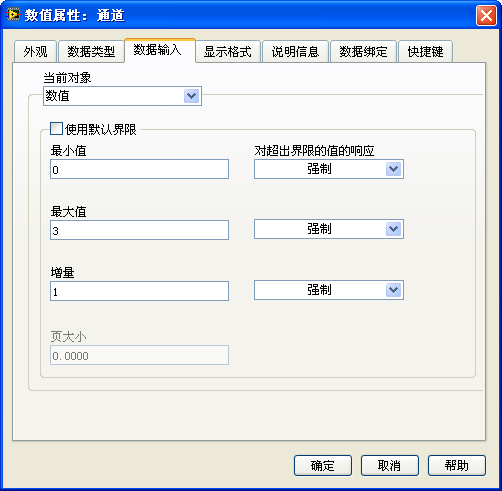
With such settings, even if a user enters an unreasonable number, such as 99, LabVIEW will disregard this invalid input.
A safer strategy is to eliminate the possibility of incorrect inputs altogether. For instance, you might use an enumeration or a ring control for channel number selection. These controls offer a limited range of selectable values, ensuring users can only choose from the correct options:
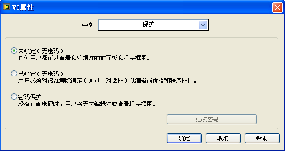
Radio buttons offer another solution, with the added benefit of displaying all available options directly on the interface, potentially with detailed explanations for each. If the interface allows for ample space, radio buttons could be an excellent choice. The interface below, part of the VI properties dialog used for setting VI passwords, clearly displays the three protection options available:
For another example, if users need to select a color on the interface, the "Numeric -> Color Box" control ensures that only valid color values can be entered, effectively limiting input to legal color specifications.
Preventing Misoperations
Users interact with software interfaces in a wide variety of ways, not always in the manner anticipated by developers. Without meticulous design, unconventional user actions, whether intentional or accidental, can lead to software malfunctions. Thus, a well-designed program interface should also safeguard against user misoperations.
One straightforward way to prevent misoperations is to disable any controls that should not be in use. For instance, consider an interface where the "Change Password" button is grayed out. This design choice is made because the user has selected "Unlocked", eliminating the need for a password. Instead of leaving users to determine whether they can use the button, it's more prudent to disable it entirely to prevent unintended errors from an accidental click. The button can be re-enabled once the user opts for password protection settings.
By selecting "Create -> Property Node -> Disabled" from the control's right-click menu and inputting 0, 1, or 2 into the disable property node, the control's state will be set to "Enabled", "Disabled", or "Disabled and Grayed Out", respectively.
Highlighting Key Elements
Interfaces should ideally be kept simple. An overload of controls, even if well-organized and logically connected, might overwhelm users, making it difficult for them to discern the functionality of each control at a glance.
If an interface is cluttered with numerous controls, the initial step should be to explore whether a more efficient layout could reduce the number of controls needed. For example, a single waveform chart control capable of displaying multiple curves could replace several individual waveform chart controls. If reducing the number of controls is not feasible, then prioritizing them based on their importance and usage frequency is essential, rather than treating all controls equally. Key controls should be placed in prominent positions and may be larger than less critical ones, allowing users to quickly identify the most important information. Take the oscilloscope interface as an example: despite its multitude of controls, the waveform display, being the oscilloscope's primary function, dominates the interface with its size and central positioning.